
Luxe on Locust
- Naomi Stein
- Mar 20, 2024
- 8 min read

Updated: Dec 13, 2024

While some Design Manifest projects look like packing the most good times possible into compact spaces (check out #WondrousWharton if you haven't already!) , sometimes we are called upon to make oversized spaces feel cozy and cavernous rooms feel inviting and intimate. Such is the case with our #LuxeOnLocust project, a beautiful brownstone in Philadelphia's Rittenhouse neighborhood. Our clients sought us out for the detail and layering of finishes in our work, and our ability to create inviting livable spaces. Their dream was to feel like home was luxury hotel experience 365 days a year. 'Like Versailles! But practical!" they explained. Happily we are well versed in delivering both polish and practicality at the same time.
The project encompassed a large family room, a kitchen and powder room that needed to be totally reimagined within the floorplan and a dining room adjacent to the kitchen, plus a huge first floor space that we envisioned turning into a sort of private supper club for our clients friends and family.
As we always do, we began by evaluating the space planning and room layouts. Figuring out how to improve the kitchen flow and open it up to the breakfast room was key, and we began to consider if and how the powder room could be relocated within this floor to facilitate better kitchen layout.

On the list of wishes was an eat-at island, a fridge with better interior layout, fewer glass front cabinets, more counter space and a better workflow. They were also hoping to have a better relationship between kitchen and dining rooms, with more flow between them.

By relocating the powder room (more on that in a moment) and eliminating the narrow hallway that ran from the second floor landing to the dining room, we were able to nearly double the kitchen's footprint, as well as create a large cased opening into the dining room, allowing for better flow and visual play between the two spaces. We inventoried all of our clients appliances, cookware and utensils, and created a thoughtful storage plan for everything from cookware to spices. We even designed a special built-in dinner station in the island for our clients pup, to avoid cluttering their beautiful kitchen up with food bowls on the floor.

We set the stage for glamour with a checkerboard marble tile in the newly defined kitchen area. Perimeter countertops in soapstone fit the bill of not being too fussy or easy to stain, and a quartzite island top gives both beauty and exceptional durability. To evoke a sense of precious luxury we drenched the kitchen walls and cabinets in Benjamin Moore's Wythe Blue, a color from their historical collection. The hue is faintly reminiscent of a Tiffany's box, and the subtleties of the shade felt both feminine and timeless, perfect for this turn of the century home.


The stained wood island is solid walnut, warm and rich with its soft open grain pattern, the perfect counterpart the the cool blue cabinetry

Our clients requested a hood design that felt integrated into the cabinetry, so we designed this built-in hood with elegant curves and fitted it out with a quiet, powerful modern ventilation unit. For fixtures, lighting and hardware we mixed nickel and brass metals to continue the play of cool and warm tones that make this kitchen so dynamic and appealing. Black accents in the lighting speak to the soapstone perimeter countertops making for a finish palette that manages to be both seamless and collected.

Across from the range wall we designed a elegant bank of cabinetry with inset arched walnut doors and reeded glass. The glass adds a sense of openness to the cabinets while still helping to obscure the details of what is inside. One of our clients 'dislikes' in the old kitchen was the abundance of glass front cabinets. While it can be nice to mix glass in to help a space feel more open, it definitely pays to be strategic with where those glass front cabinets go and what can be stored there.


To the left of the window we created a a coffee zone, nicely out of the way of the main path of work. To the right of the fridge hidden behind a deceptively simple panel door is one of the great engineering feats of this build- a dumbwaiter, used to bring dishes down to the first floor lounge and formal entertaining space. Our clients were excited to entertain, and wanted to make it as painless as possible by getting the right accessories to do some of the heavy lifting. Framing and lining the shaft for the dumbwaiter between two floors full of cabinetry and mechanicals was complex, and we're forever grateful to our awesome GC, Buono Construction, for his collaboration on this project.

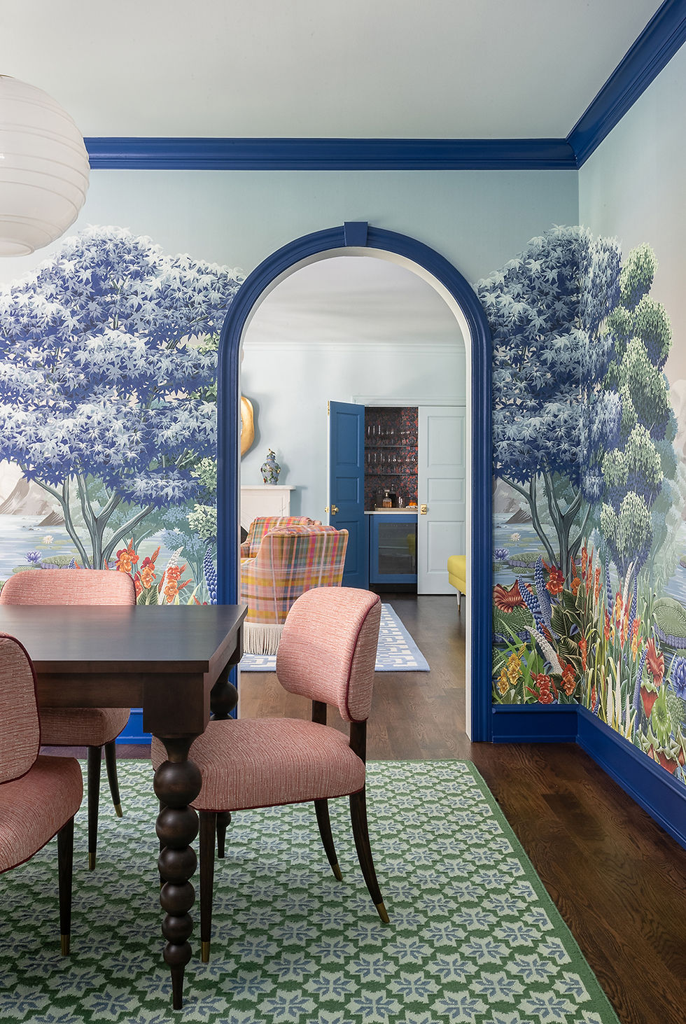
Opening the kitchen up to the dining area made for a great opportunity to layer some vibrant colors into the mutual vista between the two rooms. Our clients existing vintage rug made a fabulous foundation for the room, but for a family of two plus one pup, their existing dining table was both too large for every day and too small for social gatherings. We cozied things up with a leather banquet and a round table that has leaves to expand when more seating is needed. Two emerald velvet upholstered cane chairs make for a pleasant conversation spot by the fireplace, and can serve as additional seating when the table leaf is in.

We chose a very soft, tonal landscape mural for the wallcovering in this room, to bring movement and a playful sense of depth to the room. A deeper shade of duck egg trims the wainscot in this room, relating back to the kitchen color but adding another layer. The lighting fixtures in this space play between modern and traditional for a collected effect.

To round out the layout changes on this floor, we moved the powder room into an under-utilized corner of the very large family room. As you can see in the below floor plans, we took a window nook and just a couple of feet of length from the family room and were able to create a nice hallway into the powder room- no awkward bathroom door opening into the common area!


In approaching the family room, we knew we wanted to add layers of detail, color, and cushy loungey furnishings. Our clients envisioned this being a 'together time' room for smaller gatherings, a place to watch tv and curl up on the sofa and knit.

We indulged our clients love of decorative millwork with picture frame moldings all around the room. We went for a complete color drench once again in this room, ceiling included. The grand height and scale of the room were brought into a more intimate feel through the use of color, layered window treatments and rich textiles on the furniture. A huge hand-knotted area rug unified the space, bringing the rooms palette into one place and generously encompassing all the seating areas.

An extra deep sofa in a tonally darker blue to the walls is the perfect place for our client to snuggle up with her knitting, and a handsome leather chair and ottoman were designated as her husband's reading and tv watching spot. A third sofa in a more petite frame adds seats for when company is over.


The beautiful bay windows do not, unfortunately, have a view worth lingering on, but they do let a lot of sun glare in to the tv area. We responded to those concerns with layered window treatments that allow the option of either filtering light with the sheers, or really blocking light out with the linen panels. The painterly print on the curtains is reminiscent of decorative book end papers but gives an abstract, modern effect at the same time. The balance in layers of modern, and traditional prints, textiles, artwork and furniture frames is really what keeps this room feeling appropriate to the period of the home but not like a historical recreation.

Some other beautiful and functional additions to the room included a built-in dog crate with closed storage above (the "Puppy Palace") and a custom credenza below the tv for some stylish hidden storage.

This brings us to the first floor lounge, a space so empty and forlorn when we began that is now a kind of private luxury supper club for our clients friends and family.


Big as this room was, it lacked purpose and charm. Its location on the first floor close to the street meant low levels of natural light and it had been just an empty pass-through space for our clients for the months they were in the house before we began work. They loved to host, and knew they wanted a great formal entertaining space. We worked with them to create a customized plan detailed to their needs.


We designed a curved bar with seating and a prep sink as well as built in cabinetry that houses wine refrigerators, warming drawers to keep food ready for serving as well as serveware, barware and table settings. The dining table expands to accommodate larger parties, and then a cozy seating area towards the front of the house is a great spot for after dinner cocktails and conversation.

To make the scale of this long room really work, we designed a statement installation of wall moldings and mural wallpaper that informed both the overall color story and the repeated presence of arches and curves throughout the room.

Part of the magic in this room is the way the arched mirrors over the bar area reflect back the mural wallpaper, making its impact felt on both sides of the room. Lighting and hardware were selected to create a luxe art deco effect, with lucite and brass pulls on the inset style cabinetry. The bar countertops were a dramatic marble with heavy veining that we hunted high and low for before finding the one that matched our clients dreams.


To keep things airy and open feeling in the seating area we opted for a grouping of curvy pedestal tables rather than a traditional singular cocktail table. Opting for handsome leather wingback chairs rather than a sofa or settee allows for more flexibility in seating. Wingback chairs can be pulled up to the dining table for larger dinner parties.

We sourced a fabulous abstract print linen that pulled all of the colors of the wallpaper into a totally fresh, modern expression. They help give privacy from the street facing windows, as well as bringing great energy and movement to this little nook.
The other high impact moment in this corner is the statement upholstered banquet we designed to match the scale and grandeur of the room. Careful detailed drawings of the banquet and double and triple checking on the location of the sconces resulted in a satisfying layout across this back wall.


Not to be forgotten, we also put our touch on the lounge-level powder room. Keeping the opulent vibes going, we wrapped this powder room in an incredible botanical wallpaper that repeats the corals and greens from the lounge in its own unique way. Lucite accents on the sconces wink back to the hardware in the bar area, and you could really be forgiven for forgetting momentarily that you weren't a guest at a swanky boutique hotel.

Our clients are so thrilled with their new spaces and plan to bring us back for the upper floors as soon as they are ready for another round. We were able to deliver designs that exceeded their expectations and a renovation experience to match, which for us is always the best feeling. Its not just about the (luxury hotel) destination, after all, the ease and joy of the journey also really counts.
photography by Raquel Langworthy
prop styling by Pia Panaligan
build by Buono Construction Group


Comments