
Newtown Jewel Box
- Naomi Stein
- May 7, 2025
- 16 min read

Updated: May 9, 2025
“Jewelry is like the perfect spice – it always compliments what's already there”
– Diane Von Furstenberg
Jewelry is one of the oldest art forms. One of the first ways humans expressed themselves was through self-adornment; using shiny metal and natural materials to augment their personal beauty. Interior design seeks to do the same, both to dwellings and to the people who live within them. At its best, a good design makes the aesthetic beauty of a home shine, and accents the best qualities of a family by improving the way they coexist. This has proven true time and time again with our projects, and never more so than at our Newtown Jewel Box - a home like a gem unpolished, but full of the possibility of family brought together.

Our story begins with Hitha Palepu. Hitha has been on our radar for years - the Design Manifest blog started around the same time as her brainchild, Hitha On The Go, and over the years she had (very sweetly!) given us the occasional shout-out on her social media. Hitha always said she would hire us if she moved back to Pennsylvania. Such a kind sentiment is its own reward, which made it all the more thrilling when Hitha finally came through on hiring us!
The journey of our design collaboration was a long and winding road, beginning with the Palepu family home. We originally consulted with Hitha and her parents to redesign their existing house, which was, in her words, "a typical builder-grade home". Now that Hitha had two young children, she was eager to spend more time with the extended family - something the PA home was not quite set up for. "When I told my parents we wanted to spend more time in PA," Hitha recalled, "we knew we would need to hire a proper design firm to help us."
"At this point I’d been stalking Naomi for a few years now,” Hitha joked.
(It was mutual.)
And so, we began the journey towards creating the ideal family gathering space
- at first, in the original Palepu home.
Sadly, the family patriarch, Nagesh, received a Parkinson's diagnosis shortly after the family contacted Design Manifest. It became clear the plan would need to change. “We realized that trying to redo that particular home was not going to work. It was going to be too much work to redesign that home into what we needed."


Hitha had a dream of family togetherness that included a multi-generational home, shared by herself & her husband Sri, their children, and Hitha’s parents. The home would allow her parents to age in place, and would act as a home base for the family to spend summers, weekends, and holidays together away from the big city. The goal was to create a home that pleased all generations of family that would live there - a home that would be peaceful and accessible for the grandparents, sophisticated and easy to host for Hitha and her husband, and liveably durable for two spirited young boys. Nagesh's diagnosis drove home the importance of creating a home that would support his independent living in addition to being comfortable and beautiful.
"My cousins had bought into a new development one town over," Hitha recalls. "And my dad was like, 'Being here would be perfect'."
The neighborhood would handle any home maintenance - lawn care, snow shoveling - that could prove difficult as the parents grew older. There were new sidewalks to make the neighborhood more accessible. Best of all, buying into the new development meant the Palepus had some control over the layout of the house, and could find a floorplan that was comfortable for them all to "comfortably cohabitate". A generous great room, with connected kitchen, dining, and living spaces; a first-floor primary suite for accessibility; a separate den upstairs with connected bedrooms for Hitha, Sri, and their children.
As anyone who has done it knows - space is crucial when it comes to living with family. You want a comfortable space for everyone to gather and be together, but enough division that you can have rest and privacy when you need to. This solution allowed for enough space for all 3 generations -
provided there was thoughtful planning in the layout and furnishings.
And that, of course, is where we come in!
Since the home was in the process of being built, we had to collaborate with the builder to make selections from the available flooring, finishes, & cabinet styles that would still fit our design brief. Our goal was to work with as much as we could - it would have been too wasteful to take a brand-new home and gut it for aesthetic reasons. We instead worked with the builder to make things as good as possible given their parameters and later make impactful changes where we could.


Before - the brand-new build, prior to DM's magic touch
The builder-grade options were limited, but we made the best selections we could.
Still, there was clearly room for improvement with thoughtful changes & custom furnishings.
Stylistically, we wanted to capture the spirit of the family while balancing everyone's individual tastes. Hitha had a vision of a home that was colorful and hip, with a balanced mix of pattern inspired by the family's Indian heritage - in her words, "A modern Maharaja". "I wanted something that had an Indian feel, without being too literal..." Hitha says. "Indian touches, without feeling like a Bollywood set." On the other end, Barathi preferred a more minimal design, tending towards more neutral colors, clean lines, and pared down furnishings. Nagesh & Sri wanted comfortable furnishings, and the goal for the boys - "my feral children," jokes Hitha - was a home they could not easily destroy.

Entry Room Board & Rendering

Entry Before
In addition to accommodating the tastes of the entire family, it was important that this home maintain a sense of place - a home for an Indian-American family, one flavored by their heritage but that made sense in the context of Bucks County, PA. This manifested in the entryway via custom shaker-style wainscot, painted in a putty color to unite the wallpaper with a more neutral farmhouse vibe. Bonus - it allowed us to add character and interest to a no-frills builder-grade space.

Entry After
An "Indian Glam" home - but make it farmhouse!
We had always known we wanted to use an elephant motif in this space. In Hinduism, elephants are symbols of prosperity and good luck - auspicious symbols as you enter a home! As it was a busy pattern, we chose a neutral colorway and painted the wainscot and ceiling to match. Accent colors were pulled from the vintage rug, a hard-won piece we had searched tirelessly to find. This piece was the jumping-off point for pops of hot pink and peacock blue in the console area.

Entry Console After
Hitha requested "a great selfie spot", and the entry delivers!
The console table was custom-painted in a saturated coral pink. Twin table lamps finished in antiqued gold were topped with patterned lampshades, custom-made in a peacock-colored Indian block print. For optimal selfie-framing, we selected a curvy rosewood & bone-inlay mirror as another nod to our clients' Indian roots.
The gold-leafed pendant light is like a piece of jewelry, adorning the space like a glowy, precious bauble. "I just feel so happy every time I walk in," says Hitha. "It really is like a jewel box. It reminds me of when I was a kid, playing with my mom's jewelry before a big Indian party."
And of course, the space is durable - rug securely anchored with a non-slip pad, walls painted in a durable scuff-resistant paint, and laid out with slender furnishings to be easily passed-through by both young and old, coming and going.
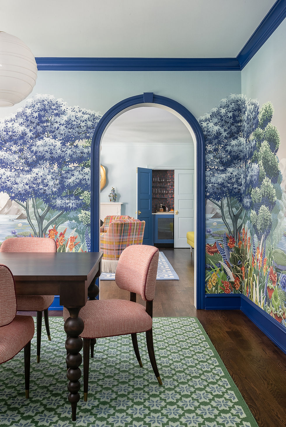
As you pass through the entry, the hall opens to the great room - a combination kitchen, dining, and living space that would be the functional heart of the home. As finished by the builder, this space was a grey box - quite challenging to inject with vibrant personality. The goal was to warm up this space with thoughtful touches that made it feel more like a personal family home - not a cookie-cutter, "anyone could live here" space, but one that was clearly for the Palepu family.

Kitchen & Dining Room Board
The kitchen, as built, was an empty slate with white walls, white tile, white countertops, and white cabinetry in the island, perimeter, and fridge wall. (Did we mention it was white?)
Our vision for this space was more saturated, with warmth added via a mix of natural materials and a rich color palate of plum, cinnamon, and chartreuse.


A broad view of the kitchen before, and our rendering of the same view
Although our goal was to save as much of the brand new cabinetry as possible, we knew this space was desperate for a grounding dose of wood grain. We opted to replace the white fridge wall cabinetry with a bank of custom cabinets in rich rift white oak, which gave space for a larger 42" paneled refrigerator and allowed for stone-encased appliance garages to hide away smaller kitchen gadgets. The wood cabinetry was adorned with shimmery brass pulls for a bit of glowy glam.

After - Kitchen Fridge Wall Custom rift-cut white oak cabinetry beautifies utilitarian storage and hides the fridge & small appliances.
Replacing the black pendant lights with warm brass hardware plays off of other brass elements in the space
like the new island pendants and shelf brackets.
The warm wood cabinetry does much of the heavy lifting to make the space feel rich, personal, and more collected. To inject more color and personality, we painted the island cabinetry in a rich sangria. "I probably never would have opted for a plum island and cabinetry," Hitha remarks, "but it's so stunning." We intended only on painting the existing island cabinetry, but an unfortunate sink leak gave us the opportunity to replace it with higher-quality bespoke cabinetry by our local maker.

We designed the dramatic black soapstone countertop with integrated sink runnels for drainage, since Barathi likes to keep things out on the countertop to dry. Soapstone is anti-microbial and resists staining from colorful spices like curry and paprika - something that had made the family hesitant to use lighter, more porous stone. The black is echoed in the metal bases of the counter stools, upholstered in a vibrant turmeric velvet.

The range wall cabinetry was kept mostly as-is, but the addition of brass hardware helped to unite it with its more colorful siblings. We added a custom stainless steel range hood with decorative brass strapping to make a more dramatic statement out of the stove. Since there are richer tones in the rest of the kitchen, the white range wall and white subway tile now feel fresh instead of bland.

Range Wall After
One of the challenges - and joys! - of the great room was that all of the spaces are open to one another. Colors had to be thoughtfully selected to coordinate naturally without being too matchy.
The goal overall was a space that feels vibrant and happy but still calm and clean.
Now that the space is more welcoming, it's fostering family togetherness. "[My son] is more excited to help out and cook in the kitchen," says Hitha.
"To have such a design challenge be our favorite place to gather together has been really special."


Kitchen & Dining After The balance of calming neutrals and rich culinary-inspired hues continue into the dining room, where a custom apricot banquette is flanked by dining chairs in performance cream fabric. One of our challenges was to design a home that was comfortable for two people but could easily adapt to six. Although Hitha & family visit often, Barathi and Nagesh are the home's primary residents. We wanted the home to have the flexibility to host without looking like a "chair store". One answer was the custom L-shaped banquette, which we upholstered in a durable paprika-colored faux leather (knowing that small boys would be running amok on it!). The dining table has an extension to allow for more people to gather.

Dining Area After
The relationship of the dining space to the outside was also important. To preserve the views to the woods outside, most of the windows in the great room are bare, but we topped the ones in the dining area with decorative faux roman shades. (The windows facing the neighbor's have hidden motorized shades for privacy.) Hitha reports that this space is perfect for some quality outside / inside time. "In the summer, if we're not outside, my dad and I...we're sitting at back table with the doors open."
Anchoring the great room is the large family room, the main gathering space.

Family Room Board & Rendering
The goal again for this space was a balance between calming neutral and energetic color. In this room, we used pattern more liberally but kept the colors a bit more restrained, all while staying cohesive with the kitchen and dining areas.
Family Room After
The crown jewel of the family room is the vintage peacock mirror, which adds sparkle and character to the otherwise neutral wall. A healthy mix of pattern brings vibrancy to the space.
The family room exemplifies our design brief - a calm yet energetic space, durable yet upscale, comfortable but fancy. "You wouldn't think a room like this is one of the most comfortable spaces," Hitha observed, "and it really is...At first glance, you would think that the couch looks stiff, or that the plaid chairs are not one of the best seats in the house. You would never guess those were recliners. The room looks precious in some ways when you first glance at it. And really, it is one of the best rooms for three generations, from 5 to 76, to spend a great amount of time together."

Being the main living space, there were a lot of comfort requests for the family room. We selected a sofa that had a shallower seat - easier for aging parents to get up out of, but still deep enough to lay down and take a nap. Swivel chairs were positioned between the kitchen and living room to allow those seated to interact with all spaces.

The plaid swivel chairs provide flexibility in seating and
bridge the gap between the living room and kitchen
One of the few requests from Nagesh was for a pair of comfortable power recliners - thrones for the king and queen of the house. "Attractive" and "Recliner" are typically words in opposition to each other - frankly, it is VERY HARD to find a recliner that looks remotely stylish. The team did a LOT of sitting in chairs at High Point Market in order to find a recliner that was not only good-looking but comfortable.
At High Point Market - Recliner shopping is serious business.

Nagesh's second request was for a beverage center to use for his nightly glass of red wine. We harmonized this bar with the kitchen by repeating the cabernet color and finding quartz countertop that closely matched the kitchen perimeter countertops. And of course, brass hardware is the final touch of glam.


Dad's third request? A cozy fireplace. For more architectural interest, we added a custom designed marble fireplace facade to replace the existing "cookie-cutter" wood mantelpiece. The stone model has a much sleeker & more modern profile, and as these photos show - it's hard to beat the warmth and texture of natural stone!
Although the great room has fostered much more family togetherness in general, Hitha feels that stylistically, this space belongs to her mom and dad. "The plaid especially reminds me of a lining of one of my dad's suits, or the scarf that he would wear when he went off to work. My mom has a Saudi or Indian outfit that matches these colors or those patterns...It feels like I've been looking at these colors and patterns forever. I really feel like this house is a mark of their personal style that I've seen and loved my whole life."
Hitha & Sri's little family, meanwhile, are more strongly represented in the loft,
where a separate living space allows them to break off for privacy.

Loft Room Board
The loft began as a cavernous room at the top of the stairs - the junction point of three upstairs bedrooms. This space was to be an offshoot gathering space to break off for more privacy. "It's sort of our respite," Hitha says about the loft. "All six of us in the same space at the same time - we all need our breaks."

Loft Before

Loft After
During our rooms review, the family responded positively to images of cozy, enveloping spaces. We carried themes from the downstairs spaces - the busy wallpaper in a neutral colorway, the clay color from the kitchen banquette - into this space, while pushing it to be a bit more saturated. We anchored the space with custom cabinetry, which provides storage while integrating with the door to the guest bedroom. The millwork was kept minimal for a transitional feel, and the shelving has exposed rift-cut oak grain to give more warmth and natural texture.

The spice-colored custom cabinetry is often the home of the boys' proudly displayed Lego creations

The warm cinnamon sofa was chosen to be both comfortable and easy to get in and out of. A chaise means that you can snuggle in when you want to, while a shallower seat makes escaping the sofa much easier. Two mid-century style stools with upholstered tops provide flexible seating, a spot for refreshments, or a place to rest your feet. Simple woven wood shades give natural texture and the flexibility to have the room dark for TV watching or bright for playing games.

The wood and bone-inlay side table brings more pattern and texture to the space.
A pair of indigo dye prints give a pop of color and a nod to Indian material culture.
"It's warm, it's cozy, but it's also got this bit of style and unexpected mix of pattern, textures and colors," says Hitha about the loft. "This room is like the person I aspire to be."

A game table is the perfect play space for the boys, who are occasionally "banished" here when things get too rowdy downstairs.
Although we didn't renovate it fully, Hitha has a soft spot for the primary bath,
saying that it's the space that feels the most like herself.

Primary Bath Room Board

The goal was to make this private bathroom feel like an intimate sanctuary, removed from the bustle of the rest of the home. This was another space brand-new space with builder-grade fixtures, perfectly fine and useable (if a bit unstimulating!). Inspired by Hitha's "modern Maharaja" brief, we made this space appropriately glamorous with a graphic botanical print wallpaper that has the perfect balance of naturalism and graphic punch. Each leaf is lined with a subtle metallic gold, and the coral background is a callback to the rest of the home. We used the black fixtures as a jumping-off point for a more deco feel, adding brass accents for contrast, sparkle, and to draw out the gold touches in the wallpaper.

Hitha had requested the use of a snake - a motif important to the family - somewhere in the primary bath. We found these charming brass towel hooks that stood out perfectly against the graphic wallpaper. A simple linen shade with ticking stripe finishes off the space.
The final room was the office - the true jewel in the crown of this home design.

The office before - a true blank slate.
This room began as a small, plain, dark room - nothing too thrilling to begin with. Upon Hitha's request, the office was to be the true "jewel box" of the house: the most intense expression of our goals for the home, with the most saturated colors, the richest feeling fabrics, and the boldest patterns. This was to be the room for Hitha to work and for Barathi to take calls, and since it was mostly used by the women in the family, we wanted it to feel sumptuous and glam. "There was this desire to create an unapologetically feminine but still cozy room," says Hitha. "That room just feels so special."

Office Room Board
At Design Manifest, we often talk about "intuitive design", or the state of achieving "mind-meld" with our clients. This space is just another example of that cosmic design connection. Having been asked to create a "color drenched jewel box", we presented a design that was saturated in bold teal - not ruby, not emerald, but a dark turquoise. Hitha recounts a story from her childhood: "One of my favorite things to do with my mom when I was a kid (and even still today!) is to play with her jewelry; try everything on. She has this turquoise, diamond and gold necklace that makes me feel something...
In my mind, Naomi, without realizing it, created the room version of that jewelry set."

Office After
The space was anchored by the desk nook, a small space defined by a wallpapered accent wall. The paper, our jumping-off point for the room, was a handblocked lotus print from local manufacturer Galbraith and Paul. We pulled a complimentary teal from the paper to paint the rest of the room, and included the ceiling to make the room feel cozy and enveloping. The pale pink chair was our "princess" moment, a modern take on a Louis chair in ballerina pink. A burl wood waterfall desk mirrors the shape of the coffee table, an acrylic model meant to keep the room feeling spacious and uncluttered. Since it's clear, the table takes up very little visual space and allows the other furnishings to shine - a great small space trick.

Through the table, you can see the lush wool rug - the last item in the project to arrive, and well worth the wait! With pale hues of yellow, red, and blue, the hand-knotted Indian rug unites the color palette while brightening an otherwise saturated space with lighter, less in-your-face color.
The ochre loveseat is multipurpose - another secretly motorized piece of furniture! This model is a sleeper sofa for the frequent visitors to the Palepu home. "My parents do host a lot," reports Hitha. "This room has been used for guests at least five times already. And everyone was like 'This is the most comfortable bed I've ever slept on'!" Because it's motorized, mom and dad can continue to host guests for years to come, without the struggle of converting couch to bed and back again.

The curtains are made from a thick, sumptuous Iris Apfel ikat fabric; leopard-spotted, but with a texture that looks like snakeskin. The cream, navy, and ruby colors unite the drapery with the rest of the space, including the batik throw pillow from Mind the Gap. Thick fabric provides darkness and privacy for any overnight guests.
Our final moment of sparkle comes from the crystal chandelier, a very sentimental item to our clients. Barathi had purchased the fixture over 20 years before, and it had sat unused in its box for most of that time. What better way to make this space feel royal and special than by topping it with the crown jewels of the family, cherished and tucked away for decades? The "lucky" chandelier is a joyful addition for Hitha and her mother: "For my mom to feel like her mark is in this room...she loves it. And I love it too."
We're not often asked to work with a blank slate. Most often, our projects are well-loved spaces that have been outgrown or become tired and stale. Our Newtown Jewel Box was a unique opportunity to inject warmth, color, and meaning into an empty box, all while making functional improvements to turn a family's aspirational lifestyle into a reality.
Style aside, the true success of this project has been the way that the functional design has deepened familial relationships. Hitha reports that the redesign has encouraged the family to spend quality time together while eliminating the stress of multi-generational living. "Even though it's smaller, the way the space is used makes it easy for all of us to spend time together in a very natural way. Now that we've created this sort of cocoon, things have gotten a lot more easeful...it really does feel we all have our little nooks and crannies." The Palepus now spend much of their time together, gathered in the great room around a puzzle, cooking together in the kitchen, or snuggled up watching a movie on the upstairs sectional. When someone needs a break (from, for example, a pair of young boys galloping about), there are comfortable spaces to retreat to and recharge, or to send energetic little ones to burn off steam on their own. The home functions perfectly as it should - supporting a family of all ages in their goal of easeful family togetherness.
Photography by Rebecca McAlpin
Design and Project Management by Design Manifest
Build by Buono Construction Group
Thanks to Hitha Palepu for her participation ❤️
Interested in making thoughtful improvements to your home? Get in touch with us here!


Comments