
Introducing: Bryn Mawr in Full Bloom
- Naomi Stein
- Jul 16, 2025
- 7 min read

Updated: Jul 30, 2025

As designers, there are certain projects that we dream about. Homes with a large project scope, broad enough for us to make a big difference. A family with colorful and interesting taste. A fitting budget that lets us source quality furnishings and high-end finishes. And the most important: A client who trusts us wholeheartedly to improve their home.
We're happy when a project has a few of these qualities; to have all of them together makes it a ✨unicorn✨. And a unicorn is what we found in Bryn Mawr! A total gut renovation of a historic Main Line home, with major layout changes to define function and optimize space, bespoke furnishings to fit perfectly into each room, and a cheerful full-spectrum color palette that feels equally fresh and elegant. What's not to love?
Our client had inherited her parents' home, a 1950's era Georgian Colonial, and had begun to upgrade it in bits and pieces. However, our client was feeling ready for a more "soup to nuts" renovation - for someone to treat the entire house holistically, all in one go. While shopping for kitchen appliances, she discussed her need for interior design services, mentioning to the sales rep, "I don't want a house that looks like every other Main Line house."
To which, the rep replied: "You need Design Manifest!"


The home had come with many of her parents' furnishings, which didn’t suit her colorful taste & bright personality. Worse, the home felt cramped, dark, outdated, and disconnected. It was begging for layout changes to optimize flow & encouraging entertaining, as well as stylistic changes to make the home more cheerful and welcoming. Our client wanted the look and format of the home to encourage togetherness in her family of 5 (plus two dogs and assorted small pets.) In her words: “I want to live differently.”

It was immediately clear this was a special project. Our client was ready to overhaul all of the spaces in the home and knew she needed our help to improve their function. The few fabrics and furnishings she supplied as a reference painted the picture of a person unafraid of bold color and pattern.
Not to mention, she was a dream client - sweet, open-minded, and trusting of the process. The scope meant it was easily Design Manifest's largest project to date.
Naomi was 8 months pregnant with her son Sebastian at the time of our first design meeting, but no matter - this was too tempting a project to turn down!
We marked the passage of time by the size of Sebastian in our site visit photos!
There are so many rooms in the scope of this project, it's impossible to do them all justice in a single entry! We'll be diving into each space in great detail in a series of blog posts. For now, please enjoy a brief taste as we introduce you to our mood, color story, and major schematic changes.

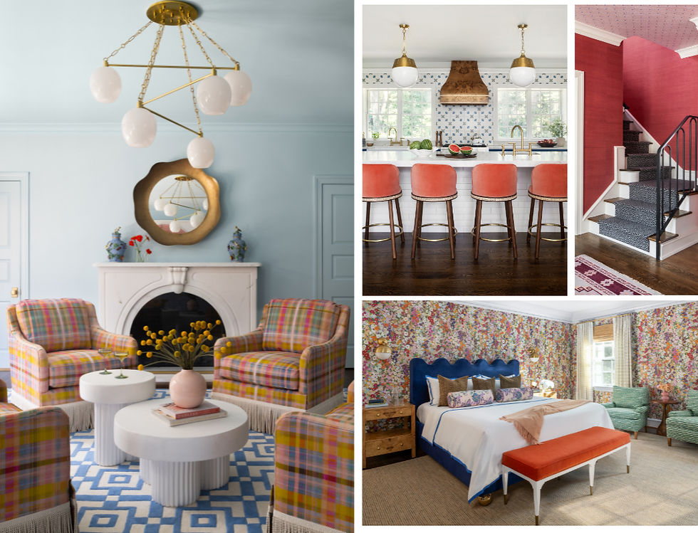
Taking cues from our client’s collection of rainbow items, our design mantra was “No White Walls”. With a client who was open to all colors, we wanted the design to feel saturated, with a balanced combination of electric colors and more muted tones to keep the spaces from feeling too juvenile. One touchstone was to layer eras thoughtfully, like when someone reupholsters their grandma’s sofa in a fun, youthful fabric (and we did end up repurposing several pieces in this way!). The goal was an overall traditional vibe with fun, funky, and modern touches thrown in for energy. Warm, enveloping, and happy - just like our client!
With a willing homeowner, you can easily become mad with power - and it was our job to make the home colorful while having restraint. Or, in Naomi's words, "without it being an insane rainbow kaleidescope".

With rainbows in mind, an early inspiration was House of Hackney's "Hollyhock" fabric. The pattern skillfully incorporates many hues but still feels balanced - all of the colors of the rainbow, without being too literal. We used this pattern as a loose guide for the mood of the project, and aimed to keep the varied palette from being too cutesy. (You'll see this pattern show up in a few places in the home!)
The real challenge was having it be exuberant and vibrant, each space distinctive, yet harmonious. With the layout improvements we envisioned, each space would flow organically into the next, and beyond. We needed to be able to layer well - 3 rooms deep! It was important to have a cohesive color story so that rooms felt related, without being too "matchy".

A few colors motifs carry through the spaces, with one of the stars being a classic Klein blue - fresh and cheerful without being too electric. Classic blue, kelly green, punchy coral, and soft lilac weave their way through the spaces, balanced with fresh white and grounded with rich wood tones, polished brass, natural stone, and organic rattan. Natural textures were crucial to balancing all that color!

Schematically, there was both a flow problem and a "room usage" problem. Many of the rooms sat unused: the furniture was old and uncomfortable; the layout maze-like and closed off; the dining room dark, far away, and never used. The goal was to create a layout that encouraged travel from room to room and improved sight lines from one space to the next.


The home was spacious, but laid out poorly. The main entrance points at the mudroom and front entry lead into tight, maze-like hallways. The dining room floated off of the entry, far from the kitchen, and felt disconnected from the rest of the spaces. The kitchen was large, but with an angled island and ill-defined functions, it somehow also felt small. The family room was directly next to not one, but two living rooms, yet none of the copious seating areas felt particularly inviting. And despite its spaciousness, the 1st floor had only a single powder room to accommodate guests. The entire floor was a labyrinth with an overabundance of ill-suited furniture.

The kitchen underwent a full gut renovation. We moved the island to be centered with the family room and created designated areas for a walk-in pantry and dining nook. Defining the functional zones meant that despite losing some space, the kitchen still felt expansive and grand. Centering the island also created unity with the attached family room. The family room was full of light thanks to its wall of windows, and we balanced the light in the attached spaces by adding two windows to the opposite wall of the kitchen.


To encourage more family gatherings, we moved the stranded dining room back to its original location next to the family room, and removed built-in cabinetry to open an original arched passage between the two. To mirror this beautiful architectural detail, we changed a single opening to the living room to a second pair of arched doorways, allowing for an unobstructed view through the home. The perfect mural wallpaper, a landscape with all of our project colors, makes this former pass-through space a real style "moment", and a custom dining table provides seating for up to 12.


The location that formerly housed the dining room was separate from most of the living spaces. We leaned into its remote location by turning the infrequently used space into a designated family activity zone. By making this a space for focus work, quiet puzzle-solving, and family game nights, the new game room became an appealing destination that our client reports is now frequently used by all members of the household.

We played up the fun of this space with a palette of lilac and coral, grounded by a neutral cheetah-print rug. Custom purple built-in bookcases have their own library ladder for your "Beauty and the Beast" moment and contrast beautifully with the patterned coral grass cloth wallpaper and orange banquette, sized perfectly to the room to accommodate many puzzle-solvers and game-players.

We straightened out the hallways on either side of the kitchen, improving sight lines and allowing for a 2nd powder room to be added to the back of the home. Built-in mudroom cabinetry created more functional storage for an active family of five. Cheerful multi-color plaid tile greets those who enter through the garage and side entrance, setting the colorful tone for the rest of the home.

On the 2nd floor, the goal was to end up with 4 bedrooms and 2 bathrooms, with one guest bedroom and both bathrooms fully furnished by DM (the other 3 to be decorated by the family's 3 teenagers!)

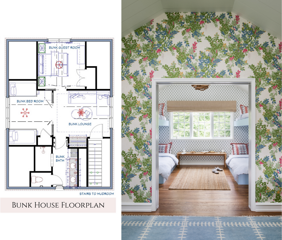
And above the garage, we planned and executed a 4-room bunk house addition, with a lounge, bathroom, and two bedrooms to host sleepovers and house out-of-town guests.
Every square foot of this home was painted with the Design Manifest brush. We added and removed walls, reconfigured door openings, built brand new windows, and reimagined entire wings of the home. By thoughtfully transforming rooms with an eye towards function, we were able to take advantage of the space and make a large home feel even more expansive and full of life. Now, formerly neglected rooms are abuzz with activity, with every inch of space having a defined, useful purpose. A vast improvement - and that's not even mentioning the COLOR!
We are so excited to share more details on this dream project and dive deep into our process, from design to construction to final install. We poured our hearts into making this home the very best it could be - every tasseled pillow, every bespoke cabinet, every tiny knob and giant chandelier. Stay tuned for more nitty gritty details on this incredible home - we've only just scratched the surface, and this mine is full of gems!
Photography: Stylish Productions
Build: Buono Construction Group
Plumbing & Appliances: Ferguson Home
Bunk House Architecture: Warren Claytor Architects

Comments