
Bryn Mawr in Full Bloom: Entry, Game Room, & Front Powder
- Naomi Stein
- Sep 4, 2025
- 9 min read


An entryway is a statement that sets the tone for the entire home. It's your chance to make a lasting first impression - to give your guests their first "WOW" moment that lets them know what your style is all about. In our Bryn Mawr project, the pressure was on to give this space the proper combination of colorful and calming; traditional and unexpected; energetic and restrained. We wanted people to immediately know the personality of the home - and be instantly knocked off of their feet!

The layout of the front of the home. For a tour of the other spaces, please view our previous posts!
Part 1: Introduction | Part 2: Kitchen & Family | Part 3: Dining & Living

To set the proper tone, the entry needed energetic color, bold pattern, traditional elements, and a little bit of whimsy. You can see virtually every room in the house from the foyer, so it needed to vibe. Grasscloth was a great way for us to put color on the walls - it has more depth and vibrancy than paint, but is calmer than a patterned paper. The candy-colored paper - a hue Naomi calls "raspberry sorbet" - was a juicy little bite of flavor for your first taste of the home.

Of course, it wouldn't be a Design Manifest home without a healthy dose of pattern! That comes in through the wallpapered ceiling and vibrant floor rug. We latched on to the rug very early on in the design process - it's a traditional pattern you might see in many Indian & Persian rugs, but the colors made it feel fresh, updated, and modern. The palette relates perfectly with so many of the adjoining rooms of the home!

For the most part, this house does not have high ceilings - it is low and sprawling. When ceilings are lower, they are more prominent. A white ceiling would feel unfinished in this space. Since we opted out of pattern on the walls, we added it above, and snagged a graphic watercolor wallpaper in a lighthearted dot pattern.

In all of our projects, we try to keep the lighting profiles the same for harmony throughout the home. Since we wanted the architecture to remain era-appropriate, lighting was a place we wanted to go more modern. This house has a lot going on with color and pattern, but it's not fussy. We kept the profiles simple, tending towards globe-y shapes in white and brass to keep the design balanced. Anything more ornate would have been way too much. (Imagine a fussy crystal chandelier here - way too over-the-top!)

Even with the vibrant color, this house is still really grounded in tradition. We wanted to mix in pieces that made sense with the history of the home. Here in the foyer, we used the client's existing credenza, a family piece we had refinished and polished up, good as new. The lighting and mirror are more modern, with the squiggly rope mirror adding the perfect amount of whimsy. This vignette, with wood tones against bright color and modern shapes against more formal, sets the expectation that it's a traditional home that likes to have fun with color.
We flanked the credenza with two extra dining chairs. True design harmony means that you can drag pieces from room to room, and they still work! In this space, they work as a spot to put on or take off shoes, and can be easily moved to the dining room for larger dinner parties.

The existing staircase was a bit too ornate and spindle-y - it's not a grand staircase for flouncing dramatically in a huge gown, so it called for something a little more simple! We reworked the stairs to streamline them and chose a cleaner metal railing with a modern silhouette & black powder coating. The speckled animal-print runner looked amazing against the coral wallpaper! To keep the balance, the rug colors stayed neutral.

From the entry / foyer, you can go left into the hallway to the kitchen, or right to go to the game room, as we'll do now!

The game room is in the space formerly inhabited by the dining room. Not only is it far from the rest of the house, it's a darker corner. It made sense for the dining room to move closer to the kitchen - but what to do with this space? It was important to give this space a purpose, and make it approachable to draw people in. What do you do with a moody, far-off room that you want to utilize?

Our solution was a combination game room & home office space, with custom library shelving for storage of books, games, puzzles, and other ephemera. We closed up the door to the living room to allow this space to feel more like a destination, accessible only from the double doors to the foyer. There's a custom L-shaped banquette for plenty of seating during board games, as well as a pair of game tables that can easily be pulled apart or pushed together depending on the needs of the day. A table and pair of club chairs in the corner is perfect for ongoing puzzle-assembling, and a desk in the opposite corner allows a private space for work-from-home - especially when the pocket doors are closed! The goal was to have this room be a chameleon - fun and energetic enough for family game nights, sophisticated enough for sexy drinks with friends, private enough for solo jam sessions, and calm enough for professional zoom meetings.

Clients tend to be a little afraid of purple. It's a color with a lot of power, and used incorrectly can overwhelm a room. A lot of people hear purple and immediately think something garish or juvenile like "Barney"! It's rare that a client is game to use this particular hue. Our Bryn Mawr client, on the other hand, is truly in love with every color - and more important, was game to let us try anything! (Well, almost. 😉)
A trusting client can feel like permission to go wild with color, but we we wanted to use purple in a way that felt appropriate to the home. Both the specific room and the hue we chose were important. The kitchen, for example, would not have been the right place for purple - this home wanted a more timeless color there. A super bright, saturated purple would have also felt gaudy and out of place. But a far-off room and a more sophisticated hue? That's a match made in heaven!
We knew that this space, as a more remote and closed off room, was the perfect place to play with "riskier" color. We've been in love with the combination of purple and orange forever - it's so juicy! - and knew that the tension between a more subtle lavender and a bright tangerine would be the perfect combination for this space. Many hours were spent painstakingly swatching for the perfect sophisticated purple and an orange with the right balance of red and yellow.

This is one of the rooms that took awhile to come together - we had to go back to the drawing board a number of times. There was QUITE the wallpaper search! Thankfully, once we found the perfect patterned grasscloth, the space started to really take shape. The paper is patterned with a playful apricot medallion motif on a soft ivory backdrop. It's very detailed and intricate, but the repeat makes it feel very symmetrical and clean, with a softness from the textured grasscloth. With all of these elements, the effect is a very cozy & enveloping space, one with a lot of energy. The neutral ground, along with the white ceiling, go a long way in balancing brightness in a moody room. And, since animal print is obviously a neutral, the leopard rug helps harmonize all of the colors!
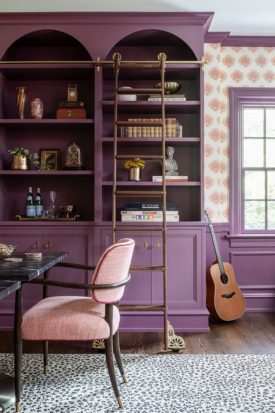
The star of this space is the purple built-in shelving and library ladder - it's SUCH a mood! The classic library ladder leans into the wonder and fantasy of the space by giving our clients their own personal "Beauty and the Beast" moment. Plus, it was fun to design a custom ladder! We spent a long time fiddling with the details to make sure it felt sturdy and had the right angle to clear the bookcase. Design-wise, the handsome wood grain adds a richness to the colorful shelving.

The custom cabinetry continues the tension of traditional and unexpected, with formal built-in bookcases made more modern with arched tops and a sophisticated purple hue. We continued the purple onto the existing wainscoting & wrapped the bottom of the bookcases in baseboard molding to make it feel original to the home. Special polished brass hardware, including glass knobs with decorative backplates, help this piece feel even more magical and bespoke. And even though it's beautiful, it's also functional, with closed storage for all of the family's puzzles and games.

This room is the perfect proof that we were able to harmonize many unique spaces throughout the home. The orange trellis swivel chair fabric is also used as pillows in the sitting room, and the kitchen & dining room chairs can be pulled into the game room for additional seating, all without clashing. It was a happy accident that the colors work together well enough that they can be pulled from room to room!

Moving back towards the kitchen brings you through the foyer and into the entry hall, a transitionary space that connects to the front powder room. Although this was a pass-through space, we wanted to be thoughtful here to make sure it succeeded in uniting rooms with distinct colors and personalities. We selected a softly undulating watercolor wallpaper in white and light blue, and had a bench custom upholstered in our favorite "Hollyhocks" pattern to give unity with the rest of the home.

From the entry hall, you can access the coat closet, kitchen, basement stairs, and - most exciting! - the front powder room.


The front powder room was the most accessible to guests, and thus needed to be more of a "wow" moment. Reworking the hallway layout allowed us more room in this space, but it was still quite small. At Design Manifest, we feel that small rooms = big wallpaper! We wanted a space that was both formal and whimsical; elegant but fun. Finding the Goddess wallpaper was crucial to setting the tone of the whole room.
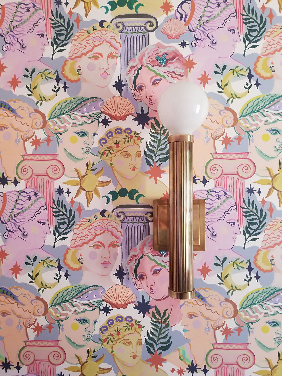
The paper had Greek goddess and column motifs - perfect for this Greek family! - but executed in a free and painterly style and a fresh, vibrant colorway. Each goddess was its own beautiful work of art in punchy brights. It felt like it had the perfect energy for this home - a balanced blend of fun, fabulous, and formal, befitting of this home’s public powder room. We fell in love with it immediately!

Once we sourced the perfect wallpaper, the rest of the design came together to support it. To calm the statement paper, we took it only to the halfway point, opting for a half-wall wainscot to balance with a more traditional element. The wainscot, trim, cabinetry, and door all got a coat of lilac paint, which both coordinated with the goddess paper and unified the powder room with the entry and game room.

We originally attempted a custom built-in vanity, but it felt a little too fussy; heavy; juvenile. Instead, we designed a more formal console sink with a leggy brass base and a custom quartz counter. The stone was designed with a scalloped splash that mirrors the edge of the counter - like an open clamshell Aphrodite might emerge from! These more formal touches helped to ground the more whimsical wallpaper.
Since we had gained length in the room thanks to the hallway rework, we were able to add a custom cabinet for closed linen storage. We painted this piece the same lilac as the half-wall and added simple, traditional brass hardware. The door pull, in particular, is a lovely little detail - it looks like a key in a lock, and we added the perfect little red tassel for a moment of fun.

This room is a bit of a show-off. It's the place you come to feel transported - the ever-important "selfie spot"! As such, our mirror selection was of the utmost importance - we needed it to make you smile.

Our powder room mirror has a gorgeous sapphire perimeter with subtle little globe details. We liked that it had something to pop it off of the wallpaper - it’s almost like a framed art piece. The blue frame is a nod back to the other spaces like the kitchen, family, and dining rooms, where we were more liberal with our use of classic cobalt. There's a little hint of brass, which plays off of the brass details of the hardware, fixtures, and lighting in this space. The mirror is flanked with a pair of sconces that pull their details - brass finish, fluted texture, and globe shades - from the rest of the home. You could almost imagine it as a modernized torch, once held by one of our colorful goddesses!
The front section of the house was meant to wow guests with the right balance of whimsy and sophistication. We were lucky enough to have brave clients who loved maximalism and reveled in the details. This was an area that we wanted to feel powerful and bold, each room being special and different - but they all GO together. We were able to layer a lot of star moments in here, and create a suite of rooms that harmonize without being too "matchy "or decorated, all while keeping time with the rest of the home.
We'll be moving towards some more private areas of the home next, bringing you a tour of the primary bedroom and connected sitting room awash in bright color and bold pattern. Stay tuned!
Bryn Mawr in Full Bloom Part 1: Introduction Part 2: Kitchen & Family
Part 3: Dining & Living
Project Credits:
Photography: Stylish Productions
Build: Buono Construction Group
Plumbing & Appliances: Ferguson Home
Bunk House Architecture: Warren Claytor Architects

Comments