
Bryn Mawr in Full Bloom: Dining & Living Rooms
- Naomi Stein
- Aug 20, 2025
- 9 min read

Updated: Sep 4, 2025
Our Bryn Mawr clients were bright and friendly, with sparkly personalities and outgoing demeanor. They wanted their home not only to reflect their colorful vibe but to support their desire to be a destination for entertaining. This was a home that could be perfect for parties, with a little help from Design Manifest!
(Need to get caught up? We detail the space planning and mood development HERE and Kitchen and Family Room design HERE.)
The entertainment spaces begin with the dining room, freshly relocated to the space next to the family room with easy access and visibility to the kitchen.

This space was formerly a little-used lounge space - crowded with furniture and most often used to pass from room to room. The "before" dining room was miles away from the kitchen in a room off of the entry way, only accessible from the foyer. Since the dining room was so far away, it was rarely used for meals. Our client was hopeful that in the renovated home, her family would more often gather together at the table. By
moving the dining room closer, we hoped to fulfill that wish.

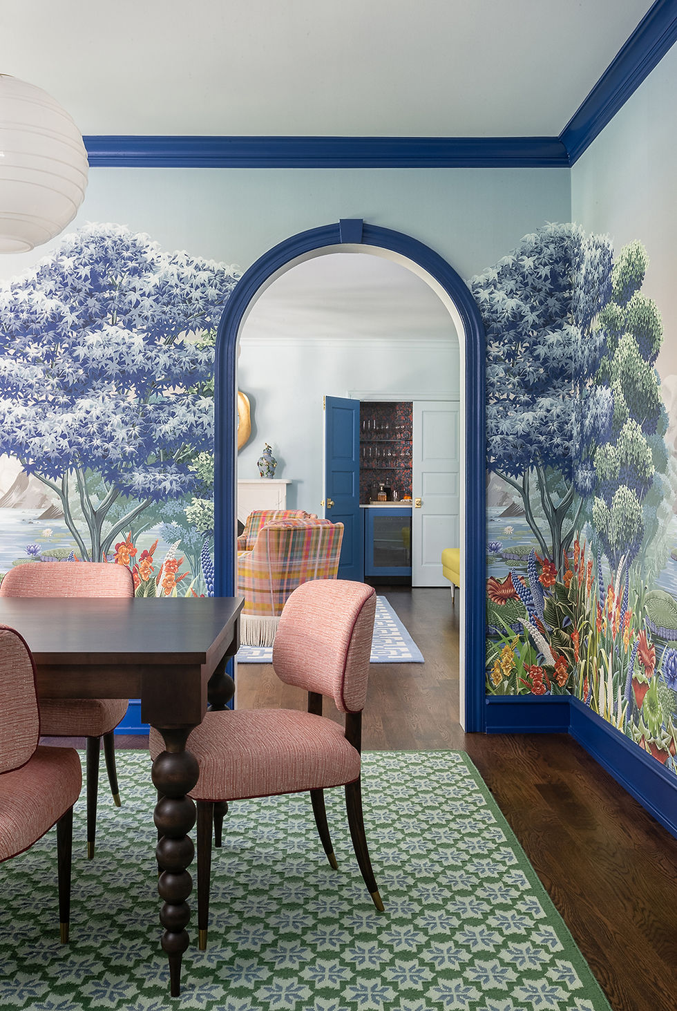
Our main architectural change was reconfiguring the door openings to make the room more symmetrical and inviting. We wanted more connection to the adjoining spaces, without necessarily having big wide openings since it also wanted to feel intimate. Our solution was for archways that punctuate the beautiful mural paper. At 44", the arches aren't super wide - just enough space to frame the view and entice you to enter the room. We dare you to try to walk past this room without being drawn in!

An arched doorway to the family room had previously been turned into built-in shelving; we converted it back into a passageway. To give more symmetry and flow, we mirrored the two arched doorways on the opposite side of the room, embracing the "pass-through" nature of the space. Having openings opposite one another made the path more direct - you no longer needed to weave to make your way through.


The goal was to support the through-traffic, while making a space so beautiful and enveloping that you had no choice but to stop and linger. (Plus, the improved sight lines created alluring peeks into adjoining spaces, no matter where you stood!)

We wanted the dining room to stop you in your tracks and delight you as soon as you entered. The showstopper moment in the space is the fanciful scenic wallpaper. The dining room has a large window to the backyard, and the scenic wallpaper was chosen to celebrate the view of nature just outside. Not only is the artwork gorgeous - the palette hits on nearly every one of the home's signature colors! It's hard not to walk in and smile. We framed the mural with classic blue trim on the baseboards, crown moulding and door and window casings.

In developing this space, Naomi was very excited to use a green rug. We had one custom made in India out of PET recycled yarn, which is very practical and durable. The pattern is a motif of an Indian Dhurrie that brought in blue and green tones from the wallpaper, and echoes the pattern in the family room chairs and kitchen banquette.

The custom expandable maple dining table has a rich dark stain to ground all of the color and pattern, but gets to have its own fun via tapered bobbin legs. The dining table has two leaves that attach at either end of the table to allow additional seating.
Our local upholsterer recovered the handsome dining chairs in durable indoor-outdoor fabric with berry trim. They are grounded by gently curved wood legs capped in brass.
The rest of the space was kept minimal, with only a white console table we had topped with quartz for easy serving. Red lacquered table lamps have bases similar to the dining table legs, and their patterned shades add just the right tension of mixed pattern.

This space is the perfect example of our overall goal: for everything in this house to be a little playful, yet also feel traditional and classic. On paper, it's your classic formal dining room with flexible seating for up to 10. Our client even takes important business dinners here now that the space is finished. It's very classic, and yet - everything in this room is just a little bit playful. The goal is to delight, but never to overwhelm.

Just beyond the dining room, enticingly framed by twin arched doorways, you'll find the living room.

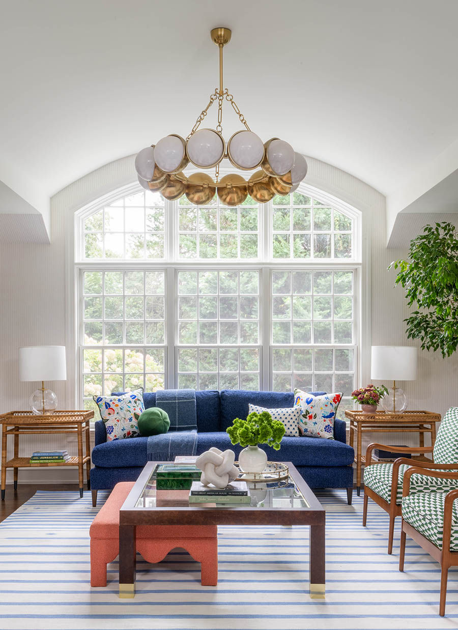
One of the big challenges of the living room was that it needed a purpose. This was not a family that needed a “formal” living room. Since it was a little removed from the highly-trafficked kitchen and family room, we wanted to create a reason to draw people into the space. One of the strengths of the space was its proximity to the pool - with its own entrance to the patio, it was one of two rooms that was easy to access from the backyard. There was already plenty of room to gather everyone comfortably in the family room, so it seemed clear that this space was more suited to be a social & intimate lounge - perfect for entertaining!
Rather than have the space center around a television, we wanted this to be a more communal, convivial space. The central element of the room is a set of 4 swivel chairs arranged around two central drink tables. We imagined it as a perfect place for our husband-and-wife clients to host another couple for drinks and conversation, in comfortable seating that all faced one another. (We also added a hidden bar to help with entertaining!) A custom channel-back banquette allowed for additional seating during get-togethers. We love a room that has flexibility to host a few or many.

Our process for designing this space was not at all straightforward - in fact, it was one of the rooms that stumped us for a long time. We became fixated on chartreuse and obsessed over trying to make the space work with yellow-green walls.

The room finally began to come together when we "murdered our darling" and gave up on the idea of having a room cloaked entirely in citron, opting instead for a color drench in soothing light blue . Grounding the room with a softer tone allowed the energetic textiles to shine. Once we embraced the change, the room came together quickly.
The right dose of chartreuse came from our custom channel-back sofa - it gave just enough bright citron energy without being too overwhelming. We swapped out the shades on the brass wall sconces, trading a neutral fabric shade for a shirred Indian block print in orange multi.
The color palette for the room was loosely inspired by a pair of ceramic bird vases that had belonged to our client's mother. They were once of a few sentimental items repurposed in the new design and we were happy to keep them in their place of prominence on the new mantel - upgraded to a more modern marble model with clean classic lines and an arched opening. Replacing the builder-grade mantel with a sexier curved model did wonders to create a commanding focal point, accessorized with an organic brass mirror and the beloved bird vases.

Another early inspiration was the swivel chair fabric. The much-beloved swatch of Anna Spiro linen had lingered on our desks for years, never quite finding the right home. Finally, we found the perfect place for our "Tattie Plaid" - a place of honor on four showstopping swivel chairs! The varied palette of pink, blue, and citron was perfect for the living room and continued the overall color story of the home. We added further drama and glam with a skirt of bullion trimming the bottom of each chair, giving exciting texture and movement when the chairs are in motion.

Since the living room is so visually connected to many other spaces, it wanted to be a little less bold - but no less fun! We made it quieter on the walls and kept the party in the middle of the room. The seating area was anchored with a geometric blue-and-white rug in performance acrylic, a practical selection perfect for an area that gets traffic from the yard and pool. The fresh sky blue walls are the perfect foil for drapery in bright orange and pink - the complementary colors create a fabulous tension that is just the right balance of energetic and calm. The drapery fabric is another Anna Spiro design, a beautiful linen with block-printed blossoms.

We labored forever to find the perfect calming blue paint - not too baby, not too soft, not too colorful. It definitely needed to be repainted at least once!
The coffee tables were a surprise element of the space. The goal was to add more dimension than a simple round table, and we used a pair of asymmetrical concrete tables to break up the symmetry of the seating area. These tables can be pulled apart to suit the needs of whomever was gathering in the living room, giving more flexibility than a single large coffee table. We loved that the coffee tables felt inspired by Grecian columns - since our client is Greek, we hid a few such Easter eggs in our design! The coffee tables felt like the right amount of sculptural without being too precious.

Being a hub of entertainment & an entry point for the pool, it was important that the living room have beverages at the ready. We knew this room needed a bar to help make it more of a destination, and we converted an existing closet into a lockable hidden beverage center. Tucking it away meant that we preserved the bulk of the floor space for seating. This mini-room has a personality all its own, both distinct from the living room while remaining complementary.


The bar - a "magical party moment"! - boasts a more energetic color story inspired by its Kristy Stafford floral wallpaper. Since the living room is one of the few spaces without wallpaper, we chose an especially bold paper for this little swatch of space. The glass shelving provides storage for drinkware without detracting from the floral pattern.
Below the Calacatta Miraggio stone counter, a beverage fridge keeps drinks cool & at the ready for parties and post-pool cocktails. Brass hardware adds a touch of glam to the blue custom cabinetry.
More than a mere jewel box, the bar is a treasure chest inside a closet that speaks SO well to the tones of the rest of the house. Viewed from the kitchen, the bar's bold colors are both enticing and harmonious - hues that work from any angle!

The "before" living room had a single entry from the dining room - for the after, we opted for twin arched doorways. The new "twin peeks" into the dining room made it all the more important that our living room selections work with the mural wallpaper. The symmetry also called for a focal point - we needed a dramatic centerpiece for the doors to flank.

If you are doing a design with lots of color and pattern, consider symmetry.
It will help the space feel more balanced and peaceful.

A large-scale paper art piece was the solution! Colorful and dimensional, this folded-paper piece has the perfect combination of tones that harmonize with both the living and dining rooms. (We found ourselves in awe of how well it works with the dining room paper - they are so good together!) The rounded shape mirrors the arched doorways for even more balance. Underneath, we placed a burl wood console table and nested twin ottomans for even more seating options. The clover-shaped ottomans have trim in classic blue to contrast the tone-on-tone lavender tweed. Each ottoman sits on casters to make it easy to pull out additional seats during gatherings.

The calming living room is a space meant to relax and enjoy all of the visual pleasures of the house - both the views outside, and the peeks into the adjoining rooms of the home. Even having closed off the entry to the game room, it's a great central hub spot that has views into the mudroom, kitchen, family room, entry, and sitting room. Although we made it soothing, it is no less cheerful, and does an excellent job uniting the colors of the home in a serene & layered way. Once you get a view into the rest of the adjoining spaces, we're sure that you'll agree!
Our Bryn Mawr clients are a gregarious family of 5. Now that the home is complete, it functionally supports their need to gather and host. Nowhere is it more clear than in the kitchen, family, dining, and living rooms, where all members of the family can gather while food is being prepared and come together at the table when the meal is ready. The family was even able to host over 30 people easily at Thanksgiving. "I loved how everyone was able to break off into little groups and have their own area to hang out," she said. "Each space had its own vibe, and everyone was able to be close but separate, comfortably."
Our next visit to Bryn Mawr in Full Bloom will give a peek into the spaces beyond, where warm color drenching and floor-to-ceiling pattern continue the balance of restful and energetic. Stay tuned for the next installment!
Part 1: Introduction Part 2: Kitchen & Family
Project Credits:
Photography: Stylish Productions
Build: Buono Construction Group
Plumbing & Appliances: Ferguson Home
Bunk House Architecture: Warren Claytor Architects
WCA also reworked the primary bedroom suite floorplan prior to Design Manifest's work on the property. In this space, this includes a living room closet that became the built-in bar.


Comments