
Chestnut Hill Promenade - Part 1
- Naomi Stein
- Jun 3
- 8 min read

The historic Philadelphia neighborhood of Chestnut Hill - with its stately homes, leafy green streets and quaint shops - is a very desirable place to live. It’s a place of tight social circles where families tend to stay for generations. Residents often gravitate toward the same few local decorators to adorn their dignified homes in a traditional - if dare we say Vanilla- style. As you guys know, we love our spaces to be a little bit fancy, but we favor a more full-flavored, complex design. I guess you could say we are more of a Lemon Curd with Blueberry swirl or a Honey Roasted Fig kind of decorator.

Luckily, our clients, who are proud Chestnut Hill residents and deeply immersed in the local culture, wanted to break from the mold for this project. For their home, they wanted something classic, yet also vibrant and unique. They longed for a fresh take that would preserve their historic home's traditional integrity and improve its function as an entertaining hub. A mix of modern furnishings, a splash of color, and a bit of the unexpected - these elements would transform their stately home from predictable beauty to showstopping stand-out.

Sounds like a job for Design Manifest! Our clients turned to us both for our layered look and our project management finesse. As they are often traveling back-and-forth to their second home in the Virgin Islands, they needed a designer who would manage both decoration and construction of their home with the utmost care while they were away. We partnered with a new general contractor and coordinated closely with trades, subcontractors, and smart home specialists to ensure every detail was executed seamlessly.
To start: a complete transformation of the first floor, focusing on layout, function, technology & decor. This historic home called for a holistic approach that would respect its character but also get down to fiddly old-home fixes: making wonky doors work, hinges shine again, and - most crucially - improving the layout to create an enticing flow from one room to the next.

Our overall creative direction was inspired by a bold, irreverent painting that contrasted the grand foyer -
a modern original by Ben Evans featuring a tennis girl smoking a cigarette. It was colorful & cheeky, and set the tone for our direction going forward.
Of course, we would design a classy, traditional home - but we wouldn't be so damn serious about it!
One of the charms of an old home is its distinct rooms. As nice as open-concept can be, the joy of separately walled off rooms is that each space can have its own personality. Our clients understood this, and rather than opening things up by knocking down walls, their goal was to refine the existing space and embrace the character of their old home.
What followed was a true whole-home rethink - not in the sense of blowing out walls or chasing square footage, but in the thoughtful refinement of an already beautiful historic home. The first order of business: a floor plan overhaul to address the clumsy layout of the kitchen & adjoining spaces.

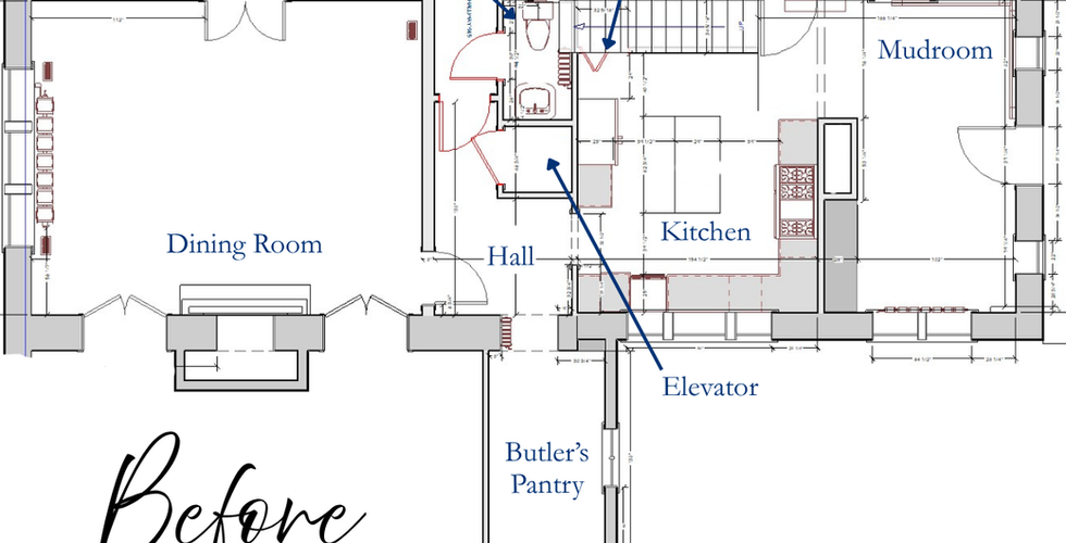


Before > After Floorplan (use arrow to toggle)
That meant carefully studying the existing floor plan and addressing the home’s biggest pain points. The basement staircase interrupted the kitchen layout, while the back elevator awkwardly divided the kitchen, mudroom, and entertaining spaces. Our clients were open to an addition, but we deemed it unnecessary, especially since they liked keeping their kitchen small and easy to navigate. Instead we focused on re-working room layouts to optimize the potential of the existing footprint. By opening up the flow and sightlines, swapping the powder and butler's pantry and relocating that pesky basement door - we dramatically improved flow while preserving the distinct, separately defined rooms that give old homes their charm.
This was a rare project where our clients did not want to enlarge their kitchen. They loved the size, but knew that we could optimize functionality, improve pain points, and - most importantly - make it prettier!


We relocated the basement stairs to the hallway, allowing more space for the 48" Sub Zero refrigerator along with a small appliance zone backed with handsome walnut.


A new second opening leading from kitchen to mudroom improved the flow of traffic and added pretty sight lines from room to room. We love improving visual relationships between room to room in old houses. Not "open concept", but "connected concept." Though the color green became a subtle through-line throughout the home, we were careful not to make the palette feel overly thematic. The kitchen itself contains very little green, but glimpses of the color appear in the connected spaces of the breakfast nook and wet bar, helping create continuity from room to room.

At the center of the room sits a custom burl and walnut island that functions equally as a hardworking prep station and a stunning furniture piece. The daughter of the family loves to bake, making ample workspace and storage essential, but we also wanted the island to ground the room visually. The island top is a extremely durable walnut crafted by Grothouse Lumber.
For the perimeter countertops and stove backsplash, we selected a pretty Monet marble with just the right balance of softness and drama.
A 36" Wolf Range sits between two archways into the breakfast room. Above it, a custom half-round stainless steel and brass range hood introduces a subtle moment of modernity within the otherwise traditional architecture. Our goal was to respect the home’s historic bones, allowing contemporary gestures to feel supportive rather than disruptive. Though the kitchen footprint remained nearly identical, newly added arched openings improved symmetry, sight lines, and natural light throughout the first floor. The breakfast nook, once disconnected from the kitchen, now feels fully integrated into the flow of the home.


The marble and travertine checkerboard floors were a big moment in this room. We wanted a floor that felt classic for an old home, one that would provide character and warmth (thanks floor heat!) without being wood. The floors carry into the breakfast / mudroom, and since this is the family's main access point into the home it was important that they be durable. After studying several historical references, we added a limestone border around the perimeter of the kitchen. It added a subtle extra touch that feels luxe and refined.
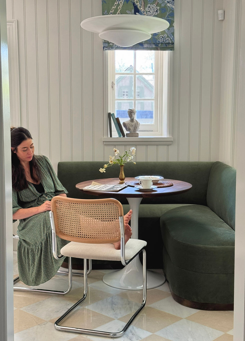
The nook had an especially difficult job to do: it needed to be both a casual dining area and the family’s primary mudroom entrance. A custom green velvet banquette helped soften the space and make it feel inviting rather than purely utilitarian. Built-in cabinetry and bench seating maximized function & storage without overwhelming the room.
Our client enthusiastically embraced playful touches throughout the project - what we jokingly referred to as “putting a bird on it.” In the breakfast nook, whimsical bird-patterned shades add personality without overpowering the architecture. These lighter moments helped balance the home’s more formal traditional elements and kept the spaces from feeling too serious or expected.


Further into the home, the wet bar became one of the project’s biggest transformations. Now positioned centrally between the kitchen and dining room, it functions as a fully stocked entertaining hub, complete with wine refrigeration, beverage drawers, generous glass storage, and integrated liquor storage.

Here, we transitioned back to refinished wood flooring, carefully studying where tile versus wood would feel most appropriate throughout the home. Because the room lacked natural light, we leaned heavily into texture and saturation: tonal grass cloth wallpaper, cabinetry, and countertops all live within a similar color family, creating a layered, moody atmosphere that feels both elegant and calm.

Before: The future location of the Wet Bar

Small details make the space especially rich. Heavy cremone hardware nods to traditional old-home detailing, while glass accents and polished nickel introduce a slightly more contemporary edge. Alabaster and brass ceiling fixtures and antique mirror backsplash continue the material language established elsewhere on the first floor.

We also repeated the arched architectural opening between the wet bar and kitchen, reinforcing consistency throughout the redesigned floor plan. The room now discreetly houses the relocated basement stair door as well - proof that functional necessities can still feel beautiful when thoughtfully integrated.
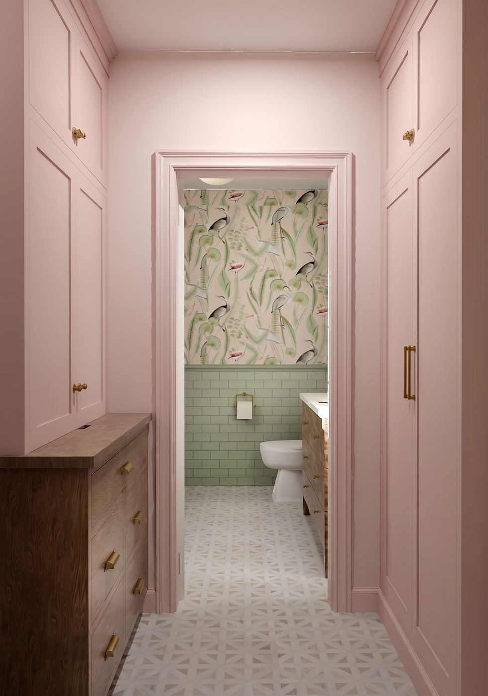
To make room for this space, we eliminated the elevator and swapped the location of the powder room, allowing the wet bar to become central to both kitchen & dining. It made sense for the powder room to be smaller and more remote, and the relocation allowed us to squeeze in more storage by way of a small pass-through organization zone. Importantly, the powder room was positioned so that when the door remains open from the wet bar, you catch a beautiful glimpse of pattern and color beyond - a small but impactful moment that helps the adjoining spaces feel connected.

The powder room became an opportunity for a livelier design moment. We managed to squeeze in even more birds here - this time in the form of a soft pink wallpaper populated by flamingos and herons. Layered with the marble mosaic flooring and soft sage ceramic wall tile, the space embraces pattern, color, and personality in a way the larger rooms intentionally do not. A burl vanity, gold mirror, and polished nickel sconces continue the nuanced mix of materials and metals.

Beyond the aesthetics of the space, we worked with all of the trades and craftsmen to ensure a smooth and timely installation. This home is full of thoughtful design: from smart switches, to integrated LED lighting in cabinetry, to details like drawer organization and ergonomics. Each trade worked meticulously with us to execute the most exacting tile design, millwork minutia, and finishing details. Love and care went into all of the work behind the walls and into every finish you see in these pictures.
And with that, the first floor finally began to feel less like a collection of separate rooms and more like a home with rhythm - layered, personal, and full of quiet surprises. Every doorway now reveals a new moment: a glimpse of green, a flash of marble, a cheeky bird, or the warm glow of brass lighting at dusk. The result is layered, welcoming, and deeply reflective of the family who lives there: elegant but relaxed, polished but never precious. Most importantly, the home still feels unmistakably Chestnut Hill - but just irreverent enough to keep things interesting.
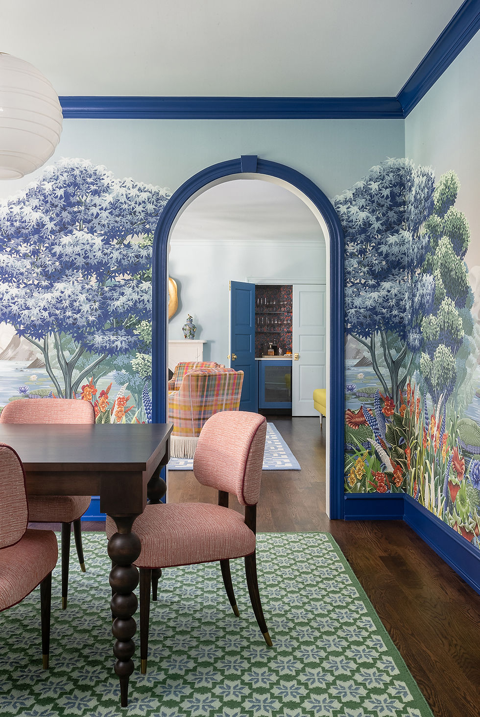
Next up, we’ll head into the home’s more formal spaces, where moody murals, bold color, and a few brave design decisions transformed the dining room, living room, and entry into some of the most memorable rooms in the house.
Design & Project Management by Design Manifest
Photography: Marco Ricca & Harrison Loomis
GC: Glendinning Contractors


Comments