
chestnut hill promenade: part 2
- Naomi Stein
- 22 hours ago
- 7 min read

Welcome back to the most fabulous home on the block.

In our last blog post we shared the renovation and reimagining of the home’s hardworking spaces: the kitchen, breakfast room, mudroom, wet bar, and powder room. We focused on improving flow, functionality, and connection while preserving everything we love about old houses.
This time, we’re talking about decoration.

Besides completely renovating the first floor, we were tasked with furnishing and decorating the home’s most prominent public spaces—the foyer, dining room, and living room—as well as two more personal retreats upstairs: the office and guest room.
As we discussed in Part 1, a colorful painting hanging in the foyer became the unlikely catalyst for much of the design direction. Ben Evans’ Tennis Girl—a glamorous young woman casually smoking a cigarette—provided exactly the sort of tension we love in design. It was playful, a little irreverent, and completely unexpected within the context of a grand Chestnut Hill home.
That painting gave us permission to add a little punk to the party.

The architecture would remain classic. The furnishings would remain elegant. But there was no reason the house needed to take itself too seriously. This house is built to be an entertaining hub- it should feel like a good time.
Dining Room: An Italian Promenade
If the foyer established the personality of the home, the dining room became its biggest design moment.
People either love murals or are completely overwhelmed by the idea. Fortunately, our clients were immediately on board. In fact, the husband enthusiastically embraced the idea from our earliest meetings, which is roughly when we knew this project was going to be fun.
The challenge wasn’t whether to use a mural. It was finding the right mural.

We wanted something traditional, green, and connected to the surrounding landscape. Something dramatic, but not theatrical. Grand but not too fancy. We ultimately landed on Iksel’s Italian Promenade—a panoramic landscape that transforms the room into an immersive destination while still feeling entirely at home in Philadelphia.

One of the things we love most about Iksel wallpapers is their remarkable hand. The subtle patina and painterly quality make them feel less like a contemporary wallcovering and more like something that may have quietly existed in the house for decades. It feels perfectly at ease within the home’s historic architecture.
The existing chair rail and picture molding provided the perfect framework. We painted the lower walls a crisp white and allowed the mural to occupy the upper portion of the room, giving it room to breathe while
preserving the architecture beneath.


The furnishings intentionally take a supporting role. A custom walnut extension table in a simple Parsons style anchors the room, while upholstered dining chairs with elegant brass ferrules add refinement without competing for attention. Overhead, a chandelier composed of delicate glass tubes manages to feel both minimal and exquisitely detailed at the same time.

Of course, no room should be forced to carry all the personality by itself.
For art, we selected a Slim Aarons photograph of Lady Daphne Cameron posing with her tiger. If Tennis Girl established the tone in the foyer, Lady and the Tiger felt like her equally fabulous friend. The two rooms now engage in a quiet conversation with one another—two glamorous women who seem entirely unconcerned with what anyone thinks.

The Foyer: Setting the Tone
The foyer occupies one of the most important jobs in the house. It serves as both introduction and transition—a place that needs to feel impressive without revealing everything at once.
Fortunately, the architecture was already doing much of the heavy lifting. Beautiful stained glass windows, an elegant staircase, and gracious proportions gave us an excellent starting point.
Rather than cluttering the space with furniture, we exercised a bit of restraint.
We replaced the existing hardwood flooring with a marble floor featuring a central mosaic “rug” and grounded the room with a substantial round center table. Twin demilune consoles and mirrors create symmetry while framing views into the adjoining dining room.

Most importantly, we gave Tennis Girl room to breathe.
The walls remain intentionally quiet, allowing the artwork and architecture to command attention. The painting serves as the home’s unofficial hostess, greeting visitors with exactly the right amount of confidence and irreverence.

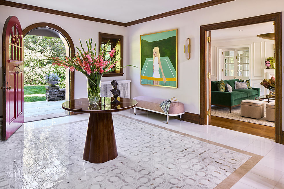
We couldn’t resist one small flourish, however. A green floral chaise tucked beneath the staircase introduces a soft layer of color and pattern—a subtle hint of the personality waiting elsewhere throughout the home.

Living Room: Classic Comfort
The living room is one of those increasingly rare spaces with no television, no competing focal points, and no obligation to be anything other than a comfortable place to gather.
It is a room for conversation, reading, cocktails, holidays, and occasionally an afternoon nap.

Before introducing furnishings, we focused on strengthening the architectural framework. New wall moldings, a marble fireplace surround, and custom walnut-backed bookcases with integrated lighting helped establish a stronger sense of permanence and craftsmanship.

Color-wise, we continued the subtle thread of greens, blues, and creams that quietly weaves throughout the home. Green became something of a recurring character during this project—not enough to make this a “green house,” but enough to create continuity from room to room.


The furnishings strike a balance between elegance and comfort. A tailored green velvet sofa feels handsome enough for entertaining yet inviting enough for everyday life. Cane lounge chairs from Alfonso Marina add warmth, texture, and a slightly relaxed sensibility that keeps the room from feeling overly formal.
One of our favorite accesories were the clover shaped ottomans. The provide addtional pull-up seating in the room and their shape mimic the pattern in the rug. providing a little whimsy in this room felt like a nice balance to all the elgance.

The room is anchored by a stunning brass dome chandelier overhead and a large glass coffee table below. With its generous proportions and beautiful rug already doing much of the visual work, the transparency of the table allows both to remain fully appreciated, helping the space feel open, airy, and effortlessly elegant.
Like many successful rooms, no single piece is responsible for the outcome. The magic happens in the layering.
The Office: A Garden Retreat
The office provided an opportunity to have a little more fun.
The homeowner was open to color, florals, and a space that felt distinctly personal rather than corporate. She serves on multiple boards and spends time in many virtual meetings, so the room needed to work hard. It simply didn’t need to look like it.

We approached the design almost as if we were creating a garden.
A lush floral wallpaper wraps the room in color and movement, while a green rug grounds the space below. The wallpaper—a contemporary interpretation of chinoiserie—feels whimsical without becoming precious.
A walnut and gold-leaf writing desk provides a polished workspace, while a comfortable chair ensures long meetings remain tolerable.

The true star of the room, however, is an oversized chaise upholstered in rosy chenille. Curved, generous, and unapologetically comfortable, it quickly became a favorite spot for both homeowner and dog alike.

Technically, it’s an office.
In practice, it feels more like a personal retreat that happens to contain a desk.
Guest Room: A Little Bit Versailles
Our internal design brief for the guest room was simply: Modern Day Versailles.
Not the actual Palace of Versailles, of course. More like an edited, contemporary version.

Blue and white became the guiding principle. Wallpaper wraps the walls and ceiling, creating a cocoon-like effect that feels charming, immersive, and just a touch indulgent. Soft blue textiles layer beautifully throughout the room, creating a space that feels collected rather than overly coordinated.

Because the footprint is modest, every inch needed to work hard. A queen bed nestles beneath the window, while integrated storage and custom radiator covers maximize functionality without adding visual clutter.

Guest rooms are often treated as secondary spaces. We tend to think they deserve the same attention as the rooms used every day.
After all, hospitality is part of good design too.
Behind the Scenes
Of course, beautiful rooms are only part of the story.
Historic homes rarely cooperate. Floors slope, walls lean, and moldings installed a century ago have little interest in aligning with new millwork. Throughout construction, we worked closely with our trades to refine countless details in the field—from integrating new built-ins into existing architecture to ensuring wallpaper, trim, and millwork all felt as though they had always belonged together.
The project also came with a non-negotiable deadline: a Memorial Day graduation celebration. With guests on the calendar and construction underway, careful project management became just as important as the design itself. By thoughtfully sequencing trades, deliveries, and installations—and leaving room for the inevitable additions that arise during renovation—we were able to deliver the home in time for the celebration, with no last-minute scrambling required.
The best project management is often invisible. When everything feels effortless in the finished space, that's usually a sign that a great deal of planning happened behind the scenes.
A Home With Personality
By the end of this phase, something interesting happened.
The home didn’t simply become more beautiful. It became more personal.
The renovation work established the rhythm of daily life. These rooms supplied the character. Now, as you move through the house, each space reveals a slightly different personality. A tennis girl greets you in the foyer. An Italian landscape unfolds in the dining room. The living room invites conversation and cocktails. Upstairs, a garden blooms in the office while guests retreat to a blue-and-white dreamscape.
The home still feels unmistakably Chestnut Hill.
It’s simply having a little more fun now.
Design & Project Management by Design Manifest
Photography: Marco Ricca & Harrison Loomis
GC: Glendinning Contractors


Comments