
Return to Miracle on 13th - 2nd Floor
- Emi Savacool

- Jan 23, 2025
- 8 min read
Updated: Jan 29, 2025

Welcome back to the Miracle on 13th Street! We chronicled our first visit to this beautiful East Passyunk brownstone back in 2022, when we refreshed the first floor living room, dining room, powder room, & kitchen. The family was waiting for the perfect moment to have us back to address the upper floors.

A few first floor rooms of the Miracle on 13th St Brownstone
It's always so flattering when our clients invite to continue designing their home.
We were thrilled to return to this South Philly gem and polish it up for our dear clients.
The couple in question favor a more modern style: urban, airy, elegant and comfortable, with enough color to be energizing and an overall sense of serenity and calm. Our clients get a lot of joy out of having spaces that feel intentional and beautiful. The goal was to have all spaces - even small, usually neglected spaces like the hallway - feel like a moment and an experience. We used the mood and color palette of the first floor as a building block for the upstairs, drawing from its modern use of charcoal with pops of energetic color.

A brief refresher on the first floor style of our Miracle on 13th Brownstone
For more, check out our first blog post!
A big part of the original first floor renovation was widening the stairs and redoing the stair railing. Removing some of the old millwork trims & simplifying them helped make the space look cleaner & more modern, and gave us a few more inches of space in the stairwell. Every little bit helps in a rowhouse!

Before and After: The first floor staircase
In this phase, we continued the stairway facelift and completely redid
all of the banisters and stair railings from 2nd to 3rd floor.

Before - The 2nd floor hallway, with our selections for the final design.
The hallway was a passage to many rooms, and it was important to keep it both stylish & cohesive

The hallway "After" The expansion allowed us to make the hallway more of a "moment". We put the drama on the ceiling with a really cool custom mural, sized to fit perfectly in the narrow hallway. The shades of charcoal, rust, and blush pull from the downstairs palette, and the pattern plays off of the glam rock feel of the clients' existing studded mirror. The custom mural could be marbled paper, a rock formation,
or the surface of Jupiter, depending on who you're asking!
Lots of little dirty work went into the hallway to make it feel clean, uncluttered, and intentional. We redid all of the recessed light trims so they would be tidy and modern. Practical changes involved moved the locations of fire alarms & changing the style of the HVAC vents to allow for a really beautiful and clean ceiling wallpaper application, uninterrupted by utilitarian fixtures. Thanks to a clever wallpaper application, an HVAC vent is virtually invisible on the patterned ceiling - try and find it in the photo above!

Mid-level lighting in the hall was added with additional sconces to replace the existing can lights - they make sure you know where you're going while keeping the vibes on point! We placed a piece of geometric artwork between them, selected for its palette of black, white, and blushy taupe as well as for its abstract cosmic feel.


After - the hallway console
We wanted the corner at the top of the stairs to have a visual purpose without feeling cluttered. Our solutions was an airy console in a brick-red color to bring energy to the dark corner. An added geometric pendant light helped brighten up the corner and make it feel glowy and inviting. And of course, our clients' very stylish studded mirror adds the perfect amount of glam-rock flair!
Next on this floor is the guest bathroom, a very dated & dark 1940s build that was not structurally sound. This space called for a drastic layout change, and we wanted one that would let us include a working tub, something the home was lacking. When brainstorming this space, our client said he might like to take baths "if the bath was not dangerous or scary". This gives you a bit of an idea of what we were working with!

Guest Bathroom - Before Dated and potentially dangerous - not our favorite combination!
The view from the hallway definitely had room for improvement.
The goal was to be able to keep the door open when the bathroom was not in use. Our solution was to convert to a pocket door to allow for more space in the room. We used a layout that put the bath/shower in front of the window for natural light and designed double curtain panels to mimic window drapes and allow more light to enter. These two changes left us enough room for both a decently sized soaking tub and a floating cabinet with storage. The vanity cabinet is white oak with a custom stain, and we designed a really cool door head style with ultra skinny frame that feels very modern and contemporary.

Guest Bathroom - Renderings
A pocket door improves the view from the hall, and orienting the tub against the window wall makes the room more functional and spacious.

Guest Bathroom - Room Board The design star of the bathroom is the marble mosaic floor tile, a modern geometric moment in blush, dark green, and black & white. We selected the rest of the elements to provide crisp, graphic modern moments that play off of the showstopper floor tile.

After: Guest Bath
What's crucial to the vibe of this house is the balance of modern & traditional. The traditional comes through in the tailored moments, and there's many in this bathroom: from the wainscot that runs around the toilet to the black pencil tile that segments the room. Even the linen shower curtains have a pinstripe pattern for a balance of tailored and natural. We wanted this space to be a "tuxedo moment" that looked great coming and going from the hallway. Modern lighting and hardware in handsome burnished brass complete the room with that extra bit of subtle sparkle, and the subtle variation on the glossy ceramic wall tile helps the room to glow.

After: Guest Bath The floating vanity keeps it feeling uncluttered and allows more room for the floor tile to shine From the hallway, you get a direct peek into the office...


Office - Before This space had a lot of potential, but needed tweaks to the layout - not to mention an injection of personality!
Our client expressed that she was game to do something moody in her office, which is a really big and sunny room. The goal was to add drama while keeping it feeling luxurious and rich. We found a paint color we LOVED that hovers between navy and black, but wanted to add more dimension.

Office - Room Board
Inky-blue walls add drama and sophistication,
and act as a luscious backdrop to rich furnishings in a limited palette
Some of our initial inspiration photos included velvet walls, and we wanted to channel that to give the room subtle texture and interest. To do that, we custom-developed a tone-on-tone velvet wallpaper by selecting the perfect fabric, treating it to make it more durable, and sending it out to have an adhesive applied. When mounted to the interior of the built-ins, this one-of-a-kind wallpaper added just the right amount of richness and texture without being overly busy.

After - Bespoke velvet wallpaper helps add the perfect dimension to the back of the built-ins -
on the left side, shelving; on the right side, a comfy bench
Our client had several requests for the furniture. The first was to keep the layout open enough to be able to pace around while working. Our client likes things looking pretty and minimal - she cleans off her desk every day! We kept it spacious enough for easy walking by removing an ill-used closet and utilizing built-ins, including a built-in bench for occasional seating for guests. The chic cabinetry has more than enough storage, including drawers in the bench for storing games, blankets, and other ephemera. In this way, we ensured that the clean look we developed would continue as our clients lived and worked in their home.

Office - Rendering
A spacious furniture plan allows for plenty of work-related pacing.
We selected pieces with small footprints to make the space feel even roomier.

After - Office
The second request was for a cozy lounge spot for reading and relaxing. This was achieved via the custom chaise tucked into the window nook. We've been ogling this piece for many seasons, as it's both chic and incredibly comfortable - the white whale of furniture! Our version is upholstered in a tiger-like statement pattern in cream and charcoal. The chaise is large enough to luxuriate during work breaks while allowing space for our client's prodigious indoor garden.

The chaise was field tested - and resoundingly approved! - at High Point Market

After - Office Sitting Area
The furnishings & features of this room have a deco styling, with lots of curved shapes and geometry. For the windows, we chose modern ripplefold drapery in a neutral linen (ripplefold being the sleekest form of pleat!) . The pale peach and rust rug brings a lightness to the dark room, keeping it feeling glowy, feminine, and not too heavy.
The geometric travertine & polished brass coffee table is a quiet stunner,
and the round shape makes a perfect fit with the curve of the settee.
(It's our client's "dedicated puzzle table"!)

Our client requested a very minimal desk that would play well with the office's dual modes of work and entertaining. We selected an elegant burl waterfall desk with lucite handles, with just enough storage to stash a laptop away after a day's work. The framed art above the desk is an abstracted arial view of ocean tides.

One complaint our client had was that her office was really chilly in the winter. Combine that with the existing faux mantle, and it's clear what was needed: a real working fireplace! To attain this, we needed to build the infrastructure to bring in a gas fireplace. The model we chose has a curved face to blend perfectly with the room's deco styling.

A faux fireplace mantel was replaced with a working gas fireplace - much more useful for a chilly office!
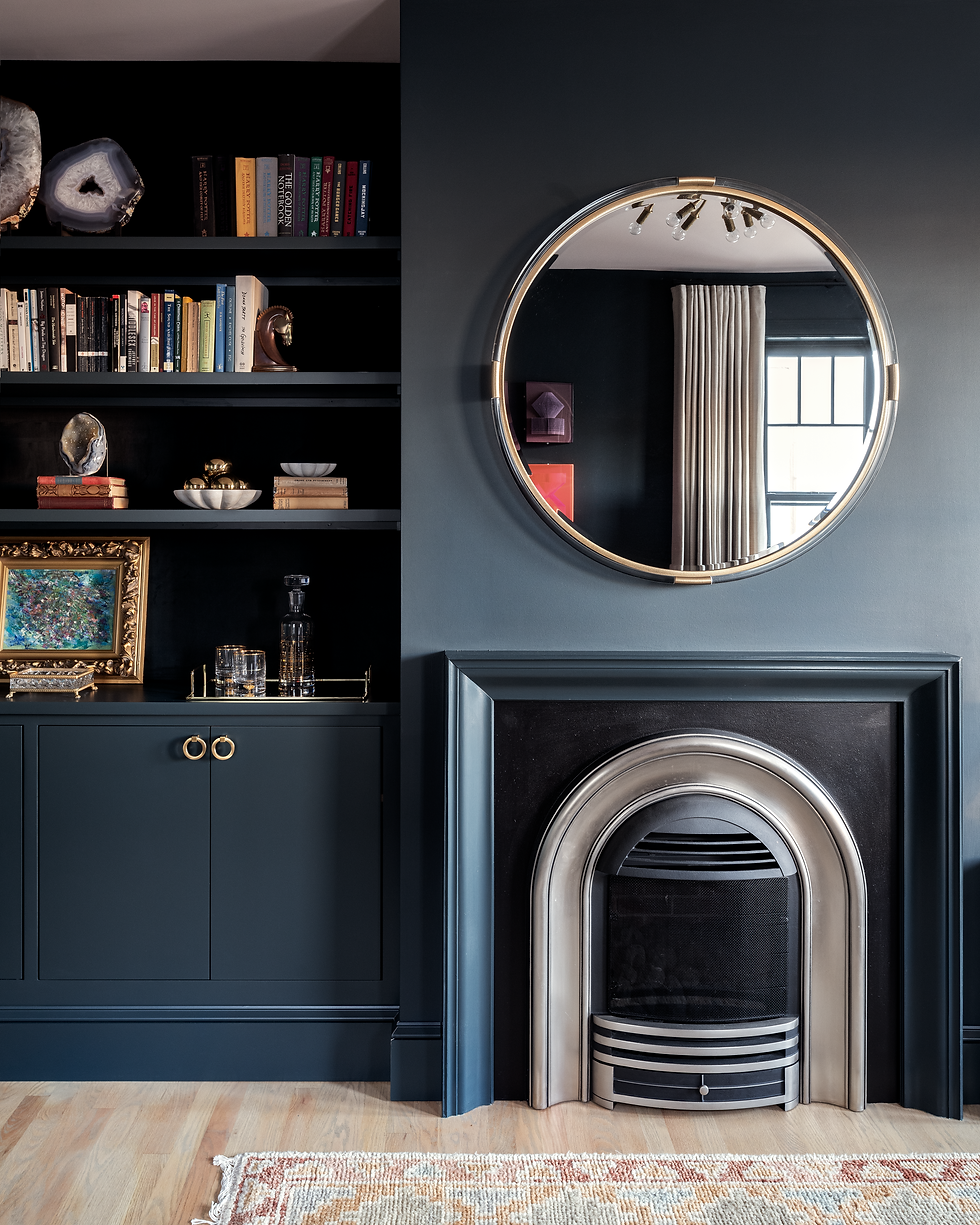
After - Office Fireplace
We want to give a special shoutout to the art we sourced for this project, in particular a triptych of book art pieces by an artist from Hong Kong. Our clients like sculptural modern art, works that are at first a mystery and reveal their secrets upon close inspection. Each piece is handmade from Chinese book pages, carved into geometric forms and encased in colored acrylic. The variants we picked were colorful enough to jump off of the charcoal-blue walls; the hot pink piece, especially, looks like it is glowing.

Office - After
The hot pink book art was so vibrant, the art hanger in charge of mounting it said,
"I don't know how to turn this off!"
This part of the project was not without its challenges. In addition to the structural issues in the hall bath, our contractor found functional deficiencies in the stairwell, an issue that had caused other homes in the neighborhood to collapse(!). The remediation meant that our clients were out of their house for a few weeks longer than planned, and were VERY eager to get home. Having been on a road trip during most of construction, the pair returned to the city, dropped their dogs off with a relative, and came straight over to see the finished project. They LOVED their revamped upper floors - everything was as good or better than they had hoped for. Now their family keeps making excuses to stop by the house so they can share in the joy of the space!
Stay tuned for the next installment of our Miracle on 13th Street Brownstone, where we'll tour the spa-like primary bathroom and peaceful bedroom sanctuary!

A teaser of the primary bedroom suite - more to come!
Photography by Rebecca McAlpin

Comments